Advice on contour plotting 2d posterior slices

I have been reparametrizing a model with convergence issues following the nice writeup of @betanalpha. I find graphs very useful for this, especially when I gradually simplify the model to isolate a pathology.

I like to superimpose contour plots and MCMC samples because otherwise (eg heatmap + posterior sample) it gets too crowded, and I am wondering if the users here have some advice on the contour plotting part.

Specifically, consider 2D version of Neal’s funnel. For consistency, I will compare contour plots with 10 levels, generated on a 50x50 grid (so some of them will be a bit jagged). The plotting library I am using takes a grid and makes levels using marching squares.

The log pdf looks nice and smooth, but kind of misses the interesting part where the mass is:

The pdf reveals the interesting part, but marching squares gives up on the “funnel”:

The simplest nice-looking option I found is replacing each log posterior value with its fractional rank in the whole matrix:

Since the last transformation gives numbers in [0,1], it is straightforward to transform them, eg this is to the above 5th power:

Any other suggestions would be appreciated.

1 Like

[edit: fat fingered first response]

The problem here looks like characterizing the level sets (set of values for which log density is constant). Assuming you don’t want to go the level of having a solver for the level set, and given that you don’t seem to want to take the obvious approach of a heat map (which doesn’t give you contours), I don’t know what to suggest.

The general problem is that you’re usually working with less regular densities that are projected out of larger densities, and therefore even harder to solve.

1 Like

I don’t think so; efficient algorithms exist for the purposes of 2D plotting (variants of matching squares and dual contouring, eg see this paper on a 3D method, 2D has been solved for a while now). Dual contouring methods use the gradients, but we already have this for posteriors.

My question is conceptual: I can obtain level sets easily. It’s about what to plot, not how to plot it.

I could, I just don’t find it very informative. Compare this heatmap using the white-red color scheme in your tutorial:

with this 10%, 20%, …, 90% plot of HPD regions (Hyndman, R. J. (1996). Computing and graphing highest density regions. The American Statistician, 50(2), 120–126.):

Regarding the original question: I think that plotting HPD regions is the most consistent solution conceptually.

I agree that the HPD regions are easier to follow.

In your particular example, I’m concerned about the artifact in neck of the funnel that makes it look like the support is wider in the x-axis than it actually is. It should go down as exp(log_sigma), but here it looks like it hits the granularity of the grid and stops. This is even more apparent with the coarser grids.

Is there a way you could use an adaptive mesh like the 3D paper suggests?

Also, what’s your thinking on presenting tails here? If we go much beyond log_sigma +/- 5, we’re already 5 sds into the tail.

Firstly we have to keep in mind that samples and contour slices do not visualize the same object. Contour slices visualize a conditional distribution, say one specified by the conditional density function

\pi(\theta_{1}, \theta_{2} \mid \theta_{3} = \tilde{\theta}_{3}, \ldots, \theta_{I} = \tilde{\theta}_{I})

where as projected samples visualize a marginal distribution, say one specified by the marginal density function

\pi(\theta_{1}, \theta_{2}) = \int \mathrm{d} \theta_{3} \ldots \mathrm{d} \theta_{I} \, \pi(\theta_{1}, \theta_{2}, \theta_{3}, \ldots, \theta_{I} ).

These will be different unless

\pi(\theta_{1}, \theta_{2}, \theta_{3}, \ldots, \theta_{I} ) = \pi(\theta_{1}, \theta_{2}) \, \pi(\theta_{3}, \ldots, \theta_{I} )

in which case there’s no reason to consider \theta_{3}, \ldots, \theta_{I} at all.

Constructing contours for the marginal density would require be able to evaluate the marginal density function and hence the above integral, which is rarely feasible. At the same time conditional samples can be generated only be filtering the available samples around some tolerance of the conditioning values \tilde{\theta}_{3}, \ldots, \tilde{\theta}_{I}. For more than a few dimensions there is not much probability of having any samples within a small tolerance and increasing the tolerance to allow more samples distorts the local conditional behavior.*

Also I’ll mention my distaste for highest density posterior intervals which are parameterization dependance, not always well-defined especially in more than one-dimension, and prone to erratic behavior at higher probability containments.

I’m not sure that there’s a solution adequate for the intended goal, but if we remove the samples and just consider the conditional contours then I’ve found that the trick is to use nonlinear levels; see for example Markov Chain Monte Carlo in Practice. This allows for a high density of level sets in regions of strong curvature and a lower density of level sets in regions of weaker curvature, although identifying a useful nonlinearity and then the right grid along the nonlinearity will in general be nontrivial.

*In theory this would be possible if one had access to the full numerical Hamiltonian trajectories and one ran those trajectories much, much longer than needed for statistical exploration. The resulting figure would resemble a Poincare section/map, Poincaré map - Wikipedia. Anyways very much not practical when working with Hamiltonian Monte Carlo output alone, but I wanted to mention it because the pictures are fun.

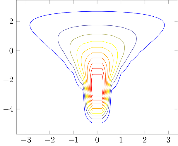
Thanks for pointing this out, in the original question I was distracted by the 2D example. Practically, I found it best to focus on contour plots of slices, ie effectively a 2D pdf. For some pathologies it was useful to run MCMC on this restricted PDF, but generally I didn’t find it helpful because the pathology did not conform neatly to slices.

I found this crude heuristic algorithm works for me when generating automated plots:

  1. take a box A_i \subset \mathbb{R}^n, generate samples using Sobol sequences, then find the, say, 0.1-0.9 quantiles of (univariate) marginals and make a box B_i out of those,
  2. each interval defining B_i is below a pre-specified fraction (eg 0.2) of the relevant counterpart in A_i, we are done, B_i will be used to generate the plots. If not, double the box A_i (eg around its center) to get A_{i+1} and go to 1.

Intuitively, this algorithm first zooms out, then zooms in. Of course it would be easy to fool (eg a mixture of 2 normals set far from each other, A_0 centered on one of them).

What allowed me to track down the pathology for this prolblem was not plots, in the end, though they did help, but carefully building up the model from a sequence of simpler ones and using simulated data. Note to self: never estimate even a mildly complex model without testing and debugging it on simulated data.

2 Likes

We should pin this advice at the top of the forums!

3 Likes

I would argue that they’re not quite that mutually exclusive. As I write about in Section 4.1 of Identity Crisis for anything but the lowest dimensional models we need to use the model structure to motivate potentially useful plots. Trying to brute force your way through hundreds of two-dimensional margins or conditional slices is never effective, and I say this as someone who has foolishly attempted the brute force approach too many times to count.

Building up a model iteratively highlights the new features that could cause problems on their own or through interactions with the previous components, suggesting effective visualizations to analyze while validating each iteration.

I agree, but I am wondering about brute-forcing problems like this with your general metric for RMHMC. Hessians are costly, but my bottleneck is researcher time. I find it especially frustrating when each run takes 30-60 minutes, so I have to keep switching context.

1 Like

My unpopular opinion is that these problems are just fundamentally difficult, and the heterogeneity in models/applications limits how much can be automated.

For example the problem with RHMC with a Hessian-dependent metric isn’t computing the Hessian, nor even the third-derivatives that are required once the Hessian is introduced, but rather integrating the resulting dynamical system. The fixed-point iterations and metric regularizations that are required typically have to be tuned to a specific problem, which requires either frustrating iteration or a deep understanding of the algorithm and the target distribution.

What makes a Euclidean metric and the leapfrog integrator so useful is its robustness. It’s not always optimal but it often works well enough, and when it doesn’t we have diagnostics like divergences that can help us identify the source of the problem as quickly as possible (although not as quickly as we might like).