Many thanks to Jonah Gabry and colleagues for sharing the visualization methods in the paper “Visualization in Bayesian workflow” and to Daniel Simpson for kindly providing the R code: I learned how to plot out the comparison of posterior predictive distribution between no pooling and partial pooling.
Here is a posterior predictive density for a dataset with no pooling:

As a contrast, the partial pooling method shows some substantial improvement:
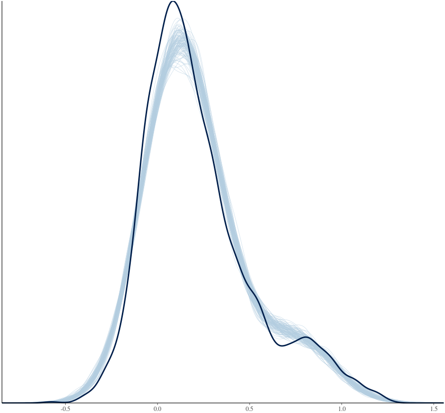
I’m pretty happy with the improvement of partial pooling relative to no pooling. However, with my model
stan_lmer(y ~ x + (1 | subject) + (x | item), data=dat, …)
what further improvement could I try? Anything better I could do about the misfit surrounding the peak area of the density curve?