Problems with shrinkage to the fixed effect in a brms multilevel model

Dear BRMS community,

I have been trying to build a simple tutorial to show how shrinkage works in a multilevel model for my collaborators. Using @Solomon 's brms example from Chapter 13 “Multilevel tadpoles”, I’ve discovered the shrinkage does not appear to always be towards the fixed effect. A reprex is below:

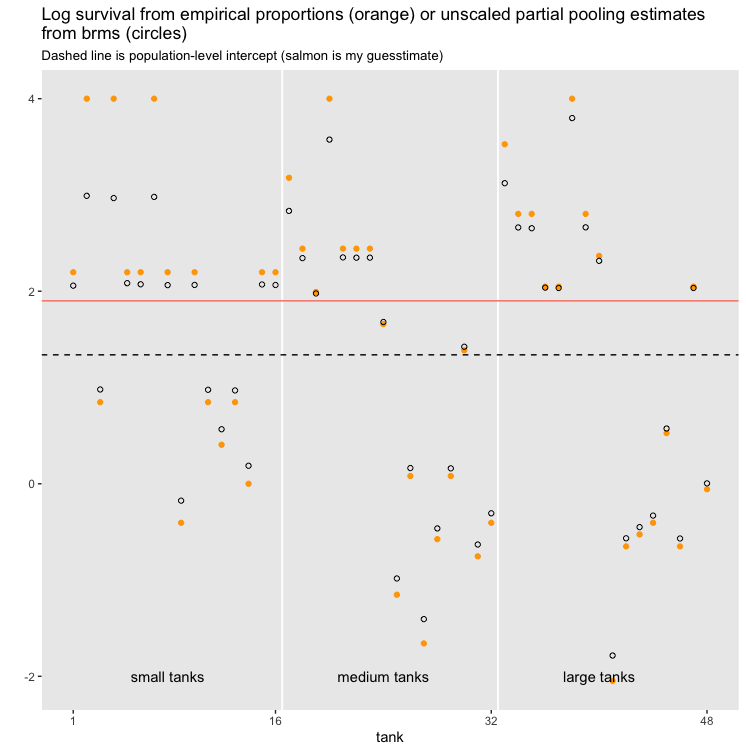
Original example is model 13.2.2 taken from here: 13 Models With Memory | Statistical rethinking with brms, ggplot2, and the tidyverse: Second edition


The tadpole data involves estimating survival probabilities of tadpoles in 60 different ponds.

library(tidyverse)
library(brms)

# Create data parameters
a_bar   <-  1.5 # average log odds of survival for all ponds
sigma   <-  1.5
n_ponds <- 60
ni      <- rep(c(5, 10, 25, 35), each = n_ponds / 4) %>% as.integer() # n per pond

set.seed(5005)
a_pond  <- rnorm(n = n_ponds, mean = a_bar, sd = sigma) # log odds survival per pond

dsim <- 
  tibble(pond   = 1:n_ponds,
         ni     = ni,
         true_a = a_pond) %>%
  mutate(true_p = inv_logit_scaled(true_a))

# Simulate data (survival of tadpoles)
dsim <- dsim %>%
  mutate(surv = rbinom(n = n(), 
                       prob = true_p, 
                       size = ni))

# Calculate no pooling estimates
dsim <- dsim %>%
  mutate(p_nopool = surv / ni)

# Fit the model
fit <- brm(data = dsim, 
           family = binomial,
           surv | trials(ni) ~ 1 + (1 | pond),
           prior = c(prior(normal(0, 1.5), class = Intercept),
                     prior(exponential(1), class = sd)),
           iter = 2000, warmup = 1000, chains = 4, cores = 4,
           seed = 1)

# conditional effects of each pond
p_partpool <- coef(fit)$pond[, , ] %>% 
  data.frame() %>%
  transmute(p_partpool = inv_logit_scaled(Estimate))

# fixed effect (model estimated average survival)
p_overall <- inv_logit_scaled(fixef(fit))[1,1]

If we then plot the conditional estimates relative to the unpooled estimates, we can see that the estimates are not always shifted (shrunk) towards the fixed effect (dotted line). This is especially clear in small to large ponds where some of the conditional effects (black) fall further away from the dotted line than the unpooled estimates (blue):

dsim %>% 
  bind_cols(p_partpool) %>%
  ggplot(aes(x = pond)) +
  geom_vline(xintercept = c(15.5, 30.5, 45.4), 
             color = "white", size = 2/3) +
  geom_point(aes(y = p_nopool), color = "blue") +
  geom_point(aes(y = p_partpool), shape = 1) +
  geom_hline(aes(yintercept = p_overall),
               linetype = "dotted") +
  annotate(geom = "text", 
           x = c(15 - 7.5, 30 - 7.5, 45 - 7.5, 60 - 7.5), y = 1.05, 
           label = c("tiny (n=5)", "small (n=10)", "medium (n=25)", "large (n=35)")) +
  scale_x_continuous(breaks = c(1, 10, 20, 30, 40, 50, 60)) +
  labs(title = "Estimates by no pooling (blue) or partial pooling (black)",
       subtitle = "Dotted line is estimated overall survival (fixed effect)",
       y = "estimate") +
  theme(panel.grid.major = element_blank(),
        panel.grid.minor = element_blank(),
        plot.subtitle = element_text(size = 10))

(apologies, but I’m not sure how to add a plot or graphic here but if it is any help then I have a github pages documenting the issue here - see Figure 2 at Partial pooling, where the estimates seem to be shrunk towards a point much higher than the fixed effect)


As an aside, if I fit the same model with lme4::glmer(cbind(surv, ni - surv) ~ 1 + (1 | pond)) then all the conditional effects fall on the correct side of the unpooled estimates.

Thanks for helping me understand shrinkage a bit better,

Rich

Hello @datarichard, how do these look if you plot some information about the posterior distribution of the subject-level predictions/estimates, rather than only point estimates? On the probability scale I suppose these posteriors will be skewed, so the posterior mean might not be the best indication of the overall shape.

To me the other limitation with this presentation is that you’ve stated the the true value (with no pooling) as the observed proportion, so these are discrete; on the graphic they align along the only possible values for each block_size. This might be obscuring some patterns; you could visualize the true_p instead.

Another consideration is that with proper priors, the estimates of the subject effects from the hierarchical model and those from the mixed model are not the same thing, right?

2 Likes

Thanks for your thoughts. Those points are all things I need to keep in mind, but I’m having trouble understanding how they might explain why the conditional estimates are not shrunk towards the fixed effect. Issues with scaling always trip me up but as far as I can tell scaling would affect both the fixed and conditional estimates equally. Instead what I see is either the fixed effect or the shrinkage effect appears to be “mislocated”, producing the appearance of shrinkage towards the incorrect location (see salmon lines in plots below).

Your concern regarding the shape of the posterior distributions is a good one - point estimates are a poor representation of the posteriors, and a symmetric distribution on the log scale might not be symmetric on the probability scale. So I’ve confirmed the distributions of the unscaled conditional effects are symmetric using plot(brms.fit) and they are. I’ve also replotted the problem on the log scale below…

In an effort to make the problem clearer (and more reproducible), I’ve taken the reedfrog data and fit the model exactly as @Solomon (happy to share my entire code if it helps).

brms.fit <- brm(data = reedfrogs, 
                family = binomial,
                surv | trials(density) ~ 1 + (1 | tank),
                prior = c(prior(normal(0, 1.5), class = Intercept),
                          prior(exponential(1), class = sd)),
                iter = 5000, warmup = 1000, chains = 4, cores = 4,
                seed = 13
                )

# scaled and unscaled conditional effects
conditional_effects <- coef(brms.fit, robust=T)$tank[, , ] %>% 
  data.frame() %>%
  transmute(
    est.brms = Estimate, # unscaled
    inv.est.brms = inv_logit_scaled(Estimate)   # scaled   
    )

# fixed effects (scaled and unscaled)
p_fixed <- median(posterior_samples(brms.fit)$b_Intercept) %>%
  inv_logit_scaled()

log_fixed <- median(posterior_samples(brms.fit)$b_Intercept)

I then reproduced Figure 13.1 from 13 Models With Memory | Statistical rethinking with brms, ggplot2, and the tidyverse: Second edition

On the probability scale there are two points where it is ever so slightly apparent the shrinkage is in the wrong direction and away from the fixed effect (the two points between the dashed line and the salmon line).

When I plot the unscaled coefficients, the aberrant shrinkage is slightly more apparent at those two points:

In both versions, the conditional effects seem to be systematically shifted towards a different location (e.g., the salmon line is my best guess) than the model estimated fixed effect (dashed line).

There must be something I’m still not understanding here…

(PS If I plot the conditional effects relative to the true values, then I won’t be plotting the amount of shrinkage any more, will I?)

I made an equivalent graphic; excuse the formatting differences as I used my own code:

reedfrog_coef <- cbind(reedfrogs, fitted(reedfrog_model, probs = c(0.25,0.75)))
reedfrog_pop <- cbind(data.frame(density = c(10,25,35)), fitted(reedfrog_model, newdata = data.frame(density = c(10,25,35)), re_formula = NA, probs = c(0.25,0.75)))
ggplot(data = reedfrog_coef, aes(x = tank, y = Estimate/density, ymin = Q25/density, ymax = Q75/density)) + geom_point(alpha = 0.6) + geom_errorbar(alpha = 0.6) + geom_point(data = reedfrogs, aes(x = tank, y = propsurv), inherit.aes = FALSE, color = 'orange', alpha = 0.6) + theme_bw() + facet_wrap(~factor(density), scales = 'free_x') + geom_hline(data = reedfrog_pop, aes(yintercept = Estimate/density), alpha = 0.6, linetype = 'dashed') + ylim(c(0,1)) + ggtitle('Hierarchical Model')

Points look the same to me. In this example the orange points are the observations, the black points are the posterior medians and the error bars are the 50% credible intervals for the conditional expected value for each tank. The horizontal lines are the population expected value for an ‘average’ tank, and the faint dashed lines are 50% credible intervals for that estimate. On the probability scale this is not dependent on density.

My observations on the graphic are:

  1. the precision of the tank-level estimates increases with the density overall, which we should expect because of the greater amount of information supporting those estimates.
  2. the further the estimates from the population prediction, the greater the shrinkage (because these are less plausible), and the more uncertain the estimate, the greater the shrinkage (because the population information is more influential).
  3. the two problematic observations you’ve pointed out (tank==24 and tank==30 on my graphic) are the ones whose observed value is closest to the population value. Particularly 30 straddles the credible interval for the population value. I think these observations simply have a negligible degree of shrinkage. The exact relationship of this observation to its shrunk point estimate is a little random, I’d say because of a combination of the discreteness of the observed value, and randomness of the estimate.

Regarding the true values in your data true_p; my thinking is that your shrunk estimates compared to those (which is what those tank-level estimates represent) might more clearly demonstrate the shrinkage effect. The manifest variable surv is discrete, and the model isn’t actually making a direct prediction about it, so it’s not an apples-to-apples comparison.

3 Likes

Thanks for making the effort. This problem has been doing my head in, but your response reassures me.

From your figure, the estimates for the two problem tanks (24, 30) are correctly ordered and so any differences with my plot are probably stochastic. Presumably if I tried a different seed value then I could get results that look more like yours. Maybe I should have tried that first :-P

I’ll have to think more on your point about true_p. I was using true_p to calculate the “error” rather than thinking about it in terms of shrinkage

(did you use set a seed value for your fit?)

1 Like

Both the seed value and the priors were the same, I just copied your code for the model.

Otherwise the only difference is that I just used fitted() which is a bit simpler but should be identical.

1 Like

thanks. The good news is that I can run the code you provided and get the same result. The bad news is that leaves me with different results produced by the same model. I think the difference is in the conditional estimates provided by coef() in my code, and the estimates provided by fitted() in your code. According to the help, fitted() is an alias of posterior_epred(), which provides the expected value of the posterior. Not sure why coef() wouldn’t use the same, but perhaps it is based on the posterior samples rather than the posterior expectation… when I have time I’ll do some further investigation. But at least your help led me to a good clue!

1 Like