Plotting predictions from an ordinal regression using the plot_predictions() function

I would like to plot predictions from an ordinal regression model conducted in brms, using the plot_predictions() function from the marginal effects package. I want to examine the effect of amphetamine-type stimulant (ats) use on psychological health over the first year of treatment for people enrolled in an opioid agonist treatment program. Here is my data.

amphUseInOTP_psych.RData (20.7 KB)

encID: factor. defines the encounter (i.e. the treatment block)

yearsFromStart: numeric, time varying. How many years the observation was made. Baseline observations made at yearsFromStart = 0. Maximum years = 1 (i.e. dataset capped at 1 year)

ats_baseline: bounded count, range 0-28, time invariant. Number of days in 28 days prior to start of treatment the client had used amphetamine.

outcome: psychological health, 0-10 integer variable indicating overall psychological health in the four weeks prior to measurement. Higher scores indicate better health.

rm(list = ls())

load(file = “amphUseInOTP_psych.RData”) # object is amphUseInOTP_psych

# load data and create label for graph
workingDF <- amphUseInOTP_psych
outLabel <- "Psychological Health" 

# # to be able to compare the gaussian with the ordinal we need to make the outcome a positive integer (or an ordered factor), so we need to make the scale go from 1-11 instead of 0-10 (see https://discourse.mc-stan.org/t/using-loo-cv-to-compare-a-gaussian-model-treating-a-0-10-integer-variable-as-numeric-to-another-model-treating-the-same-variable-as-ordinal/39219)
workingDF %<>%
  mutate(outcome = outcome + 1)

range(workingDF$outcome)

fit_ordinal_psych <- brm(formula = outcome ~ ats_baseline*yearsFromStart + (1 | encID),
                         family = cumulative("probit"),
                         data = workingDF,
                         save_pars = save_pars(all=TRUE),
                         seed = 1234,
                         refresh = 0)

fit_ordinal_psych

# output

# Family: cumulative 
# Links: mu = probit 
# Formula: outcome ~ ats_baseline * yearsFromStart + (1 | encID) 
# Data: workingDF (Number of observations: 2032) 
# Draws: 4 chains, each with iter = 2000; warmup = 1000; thin = 1;
# total post-warmup draws = 4000
# 
# Multilevel Hyperparameters:
#   ~encID (Number of levels: 621) 
# Estimate Est.Error l-95% CI u-95% CI Rhat Bulk_ESS Tail_ESS
# sd(Intercept)     0.77      0.04     0.69     0.86 1.00     1171     1933
# 
# Regression Coefficients:
#   Estimate Est.Error l-95% CI u-95% CI Rhat Bulk_ESS
# Intercept[1]                   -3.20      0.15    -3.50    -2.93 1.00     2186
# Intercept[2]                   -2.65      0.10    -2.85    -2.47 1.00     2653
# Intercept[3]                   -2.04      0.07    -2.19    -1.90 1.00     2706
# Intercept[4]                   -1.55      0.06    -1.68    -1.43 1.00     2443
# Intercept[5]                   -1.13      0.06    -1.24    -1.02 1.00     2479
# Intercept[6]                   -0.42      0.05    -0.53    -0.31 1.00     2616
# Intercept[7]                    0.10      0.05     0.00     0.21 1.00     2724
# Intercept[8]                    0.79      0.06     0.68     0.90 1.00     2803
# Intercept[9]                    1.80      0.07     1.66     1.93 1.00     2823
# Intercept[10]                   2.48      0.08     2.32     2.65 1.00     3382
# ats_baseline                   -0.04      0.01    -0.06    -0.02 1.00     1945
# yearsFromStart                  0.47      0.09     0.29     0.65 1.00     4051
# ats_baseline:yearsFromStart     0.05      0.02     0.02     0.09 1.00     3453
# Tail_ESS
# Intercept[1]                    2617
# Intercept[2]                    2985
# Intercept[3]                    2500
# Intercept[4]                    3014
# Intercept[5]                    2888
# Intercept[6]                    3303
# Intercept[7]                    2820
# Intercept[8]                    2684
# Intercept[9]                    3040
# Intercept[10]                   3146
# ats_baseline                    2791
# yearsFromStart                  3121
# ats_baseline:yearsFromStart     3097
# 
# Further Distributional Parameters:
#   Estimate Est.Error l-95% CI u-95% CI Rhat Bulk_ESS Tail_ESS
# disc     1.00      0.00     1.00     1.00   NA       NA       NA
# 
# Draws were sampled using sample(hmc). For each parameter, Bulk_ESS
# and Tail_ESS are effective sample size measures, and Rhat is the potential

The negative ats_baseline intercept suggests that, at time 0, the higher your ats use at baseline the lower your baseline psychological health. The positive yearsFromStart coefficient indicates that among people who were using 0 ats at baseline, there was an increase in psych health over time. the positive interaction means the greater your rate of ats use at baseline the greater your rate of increase in psychological health.

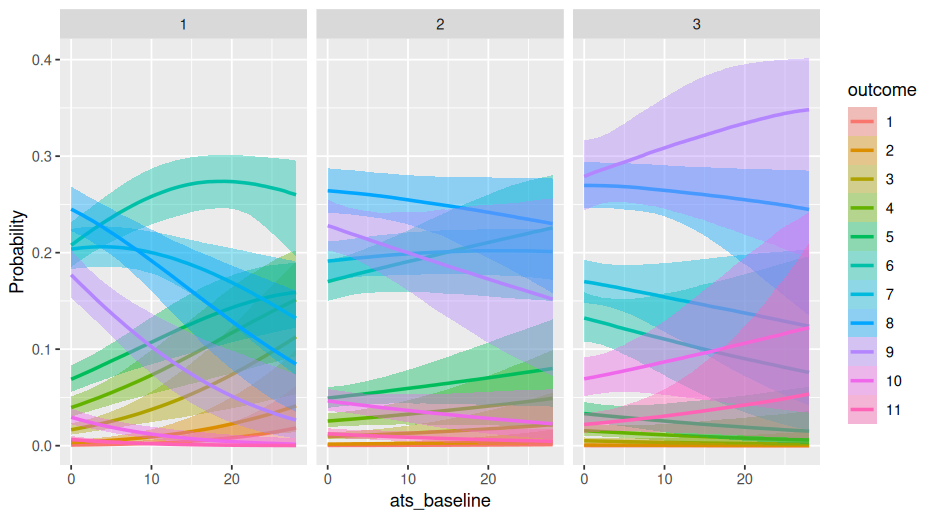
Now I would like to plot predictions from the model using the plot_predictions() function from the marginaleffects package. I would like to plot predicted levels of psychological health on the same 1-11 scale, at five timepoints - 0 years, 0.25 years, 0.5 years, 0.75 years, and 1 year - for each of five candidate levels of ats_baseline: 0 days, 7 days, 14 days, 21 days and 28 days.

I tried using the following code

library(marginaleffects)
plot_predictions(model = fit_ordinal_psych, 
                 condition=list(yearsFromStart=seq(0,1,length.out=40),
                                ats_baseline=c(0,7,14,21,28)),
                 type = "response") +
  scale_y_continuous(breaks = seq(0,10,2)) +
  coord_cartesian(ylim = c(0,10)) -> predictionPlot_ordLinPsych

predictionPlot_ordLinPsych

But the graph is obviously wrong

Does anyone know the correct syntax to get this on the right scale?

You need to add the facet, like this

plot_predictions(model = fit_ordinal_psych, 
                 condition=list(yearsFromStart=seq(0,1,length.out=40),
                                ats_baseline=c(0,7,14,21,28)),
                 type = "response") +
  scale_y_continuous(breaks = seq(0,10,2)) +
  coord_cartesian(ylim = c(0,10))+
  facet_wrap(~ group)

Thank you @Mauricio_Garnier-Villaire but I need all lines in the same figure rather than five separate figures and , most importantly I need the predictions on the original 0-10 scale.

Below is the conditional_effects output.

Could you say a bit more about what you want, that is different from that?

conditional_effects(fit_ordinal_psych, 
                    effects = "ats_baseline",
                    conditions = data.frame(yearsFromStart = c(0,.5,1)),
                    categorical = T)

To change to predictions to the original scale use

type = “prediction”

Hi yes thank you for responding. I want the predictions for different candidate ats_baseline levels (as specified above 0, 7, 14, 21, and 28 days) at five different timepoints expressed on the original 0-10 scale (although it would be 1-11 after the transformation to integer). I’m not sure what the graph you posted is.

Thanks @Mauricio_Garnier-Villarre, definitely an improvement. I ran

library(marginaleffects)
plot_predictions(model = fit_ordinal_psych, 
                 condition=list(yearsFromStart=seq(0,1,length.out=40),
                                ats_baseline=c(0,7,14,21,28)),
                 type = "prediction") +
  scale_y_continuous(breaks = seq(1,12,2)) +
  coord_cartesian(ylim = c(1,12))

Which yielded

This is definitely closer than before, however I think there are some grouping issues. with the lines. Usually in the mapping function in ggplot there is a group = foo function or a colour = foo but I’m not sure how to do it in the plot_predictions function since the grouping should be taken care of by the condition argument.

The predictions derived from the Gaussian version of the model using the dame data…

fit_gaussian_psych <- brm(formula = outcome ~ ats_baseline*yearsFromStart + (1 | encID),
                          data = workingDF,
                          family = gaussian(),
                          prior = c(prior(normal(5, 3),
                                         class = Intercept),
                                    prior(normal(5, 3),
                                          class = b),
                                    prior(cauchy(1,2),
                                          class = sd)),
                         save_pars = save_pars(all=TRUE),
                         seed = 1234,
                         refresh = 0)

…are easy to graph using very similar syntax

plot_predictions(model = fit_gaussian_psych, 
                 condition=list(yearsFromStart=seq(0,1,length.out=40),
                                ats_baseline=c(0,7,14,21,28))) +
  scale_y_continuous(breaks = seq(1,11,2)) +
  coord_cartesian(ylim = c(0,11)) -> predictionPlot_gausLinPsych

predictionPlot_gausLinPsych

Yielding this graph

I hoped that I could get the predictions from the ordinal model - which handily outperforms the Gaussian in loo-cv and k-fold comparison - to look similar to this graph.

I should also note a mistake in my original post (which it seems I am not allowed to edit any more): I said that I wanted predictions at 0, 0.25, 0.5, 0.75, and 1 years from start of treatment, but clearly my code is attempting to generate predictions at 40 points between 0 and 1 years.

The grouping is taken care, that why you get the colors and “ats“. You can see the layers and data like this

pp ← plot_predictions(model = fit_ordinal_psych,
condition=list(yearsFromStart=seq(0,1,length.out=40),
ats_baseline=c(0,7,14,21,28)),
type = “prediction”) +
scale_y_continuous(breaks = seq(1,12,2)) +
coord_cartesian(ylim = c(1,12))

pp$layers
pp$data

Since it is a ggplot object, you can add more layers and colors.

Your first graph is the ordinal version of this gaussian prediction graph. But you cannot get the same type of lines. Because the gaussian model will predict decimal values between 8 and 9 for example. But the ordinal model will only predict integer numbers. Thats why the ordinal graph has flat lines, it can only predict 8 and then jump to 9, will not have predictions in between.

In the gaussian you dont need to add type=prediction, because its gaussian with an identity link, the types give the same prediction

I think the loo is not appropriate to compare models with continuous vs categorical families. Would have to check back if this is an appropriate comparison

Thank you for the information, that makes sense that, given it being an ordinal model, the graphs make those odd-looking stepped jumps from one integer level to the next. Your last point I definitely can speak to: as long as you are using the same data and those data are integers, you can compare a gaussian version of the model to an ordinal. It’s also worth noting that when the data are bounded counts, you can also compare gaussian to binomial models.

see here and here for an explanation by Aki Vehtari.

Oks, I hacent seen that in the case of that data structure, you can compare them. Good

Given the overlap between prediction lines, I think it looks better with the facet_wrap, allows to see each line better

plot_predictions(model = fit_ordinal_psych,
condition=list(yearsFromStart=seq(0,1,length.out=40),
ats_baseline=c(0,7,14,21,28)),
type = “prediction”) +
scale_y_continuous(breaks = seq(1,12,2)) +
coord_cartesian(ylim = c(1,12))+
facet_wrap(~ats_baseline)