Please also provide the following information in addition to your question:
- Operating System: windows 8.1
- brms Version:2.7.0
Dear community, I am struggling with getting a good understanding of the model output and its calculation from brms.
I built a model to understand butterfly mortality through time (week), region, and investigate differences among species. Here is my model (convergence was fine):
summary(mod21)
Family: binomial
Links: mu = logit
Formula: ind_dead | trials(total_ind) ~ 0 + region_butterfly +year + s(week, by = butterfly, k = 4)
I am now interested in the smooth part of the model and would like to plot s(week, by = butterfly, k = 4), all other predictors, year and region_butterfly, conditionned on their mean (and not on the reference category, as they are categorical variables). I first extract the table of predicted values:
smooth_week<-marginal_smooths(mod21,robust=FALSE,method=“predict”,conditions = data.frame(year = NA,reg_butt=NA))[[1]]
the plot of this table is the following:

But to get a better feeling of these variations, I would like the estimates to be backtransformed to my initial scale. As the model is binomial, the estimates and confidence intervals returned from the marginal_smooth are on a logit scale, which I therefore transform (hoping that so far my understanding is correct):
smooth_week$mortality=inv_logit_scaled(smooth_week$estimate__)
smooth_week$inv_low=inv_logit_scaled(smooth_week$lower__)
smooth_week$inv_upp=inv_logit_scaled(smooth_week$upper__)
I now get the following plot:
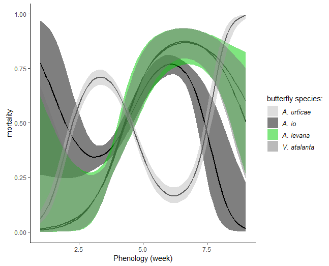
here are my specific questions:
-
when extracting the marginal_smooth, is the argument “conditions” necessary to get estimate on the average mean of the other predictors? I assumed this function works as the marginal_effect function. In my specific case I also wonder if I should specify region_butterfly=NA because I would like to get mortality per week and butterfly averaged on region (and not on region_butterfly).
-
I am sceptical that the transformation (inv_logit_scaled) did what I initially intented to get, which is the average mortality. For example, I know from my data that the average mortality of A. levana is on average below 10%. While in the first plot my understanding is that what is plotted is the variations in mortality for each species relative to the mortality of that species at the average week (around 4-5) on a logit scale, I cannot make sence of what I plotted in the second figure.
-
is my only option is to extract the posterior from the 4 chains and average the values following the categories I intend to plot?