Following the conversation from several weeks ago - I set up the model as follows:
formula<-bf(poverty ~ 1 + gdp +(1|Country) + (1|Country:Region) ,
phi ~ 1 + gdp +(1|Country) + (1|Country:Region),
zoi ~ 1 + gdp +(1|Country) + (1|Country:Region),
coi = 1 ) # coi is set up to 1 as there are no data with poverty rate equal to zero
fit.model<-brm(
formula,
data=sample,
family= zero_one_inflated_beta(),
chains = 4,
iter = 3000,
warmup = 1000,
cores = 4,
backend = “cmdstanr”,
threads = threading(1),
control = list(adapt_delta = 0.99)
) # no priors set up for this model
For this model I have 16 Countries which have from 1 to 149 Regions with different number of surveys in each Region. In total I have over 8,000 surveys (but I tested this model also on over 90,000 surveys from 16 Countries as well as on a dataset where there was equal sample size for each Region).
The model runs, it converges well. The Rhats are healthy (all 1.00), the fit has no divergences, and ESS look reasonable (all more than 1800).
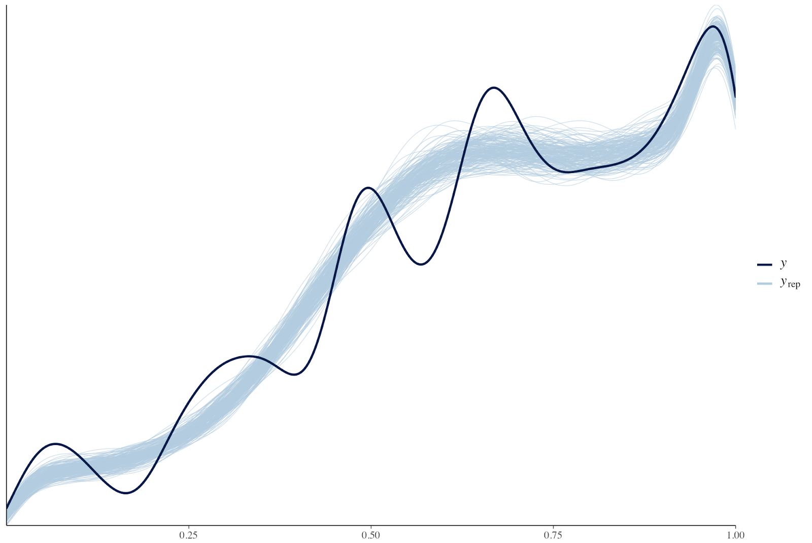
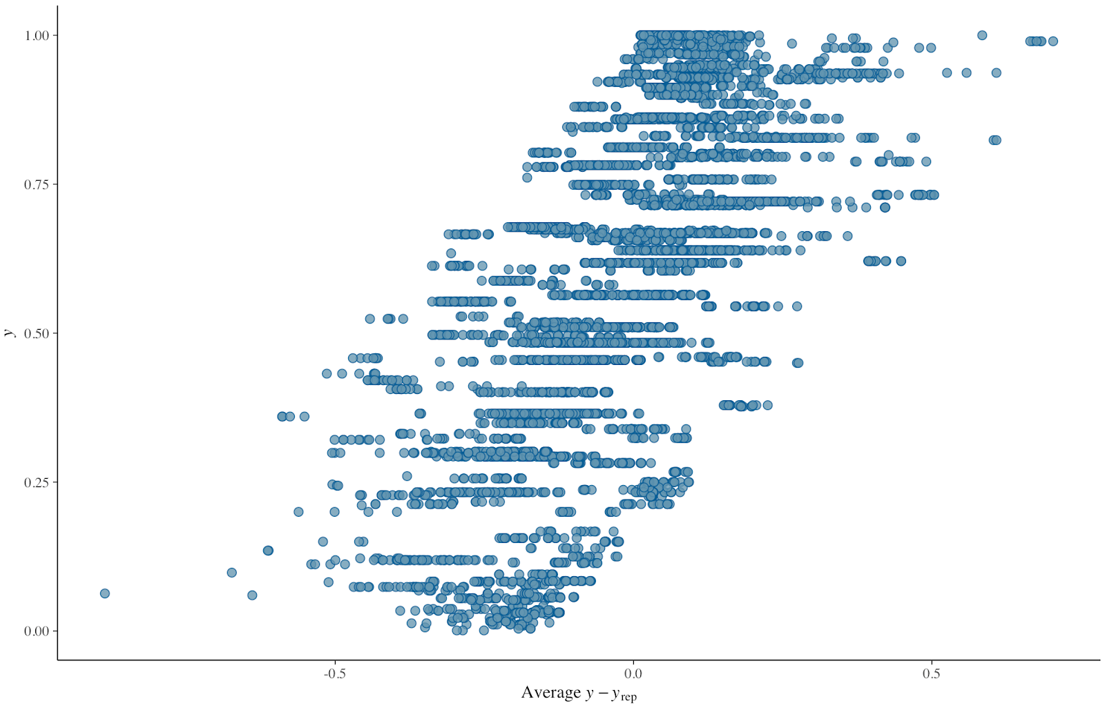
The graphs for posterior predictive checks look as follow:
- graph for comparing distribution of the observed variable (y) to the distributions of some of the simulated datasets (yrep) (pp_check(fit.model, ndraws=200)):
- The scatter plot of residuals (x axis) plotted against the observed variable (y) (pp_check(fit.model, “error_scatter_avg”)):
The question I have is as follows.
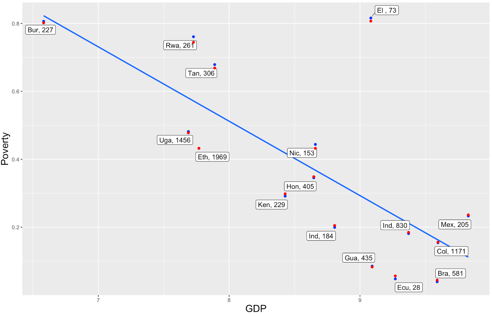
I am using GDP as a country-level predictor and, in the graph below, I show the GDP vs Poverty Rate. I would expect that the model’s predicted poverty rates shift towards the regression line (the blue line showing relationship between gdp and poverty for the observed data). But in the graph some of the red points (the model’s predicted poverty rates) shift away from the line, and I am not sure what’s the explanation for this.
The blue dots are calculated by taking the averages at the regional level and then taking the average of the regional averages to get the country average. Changing the approach to poverty rate calculation (taking the average of all data at the country level) gives nearly the same results. The labels indicate the country and the number of surveys in each country.
Would you have any suggestion what can be happening here and how I can try to improve that? I tried various things already:
- to simplify the model (reduce the number of levels only to Country).
- not model for phi nor zoi.
- take various sample sizes from the original dataset to check the behavior of the model.
- I tried using the default brms priors and other non-informative priors recommended in the Andrew Heiss blog post: “A guide to modeling proportions with Bayesian beta and zero-inflated beta regression models”.
- I also tried change the way the blue dots are calculated (simple average for a Country from all data for given country, average of averages of poverty at Regional level to get the Country average)
- Should I expect the “red dots” to get close to the line. If no, why?
- If yes, what are some other possible causes of why this is happening.
Would you have any suggestions about what might be missing in the model?