Group-level predictors in brms

Hi, I have a question related to setting a brms hierarchical model. We had built a model in Stan, but we want to know if there is a way of implementing it in brms. In particular, we are not sure how to add group level predictors in brms… We want to do this, because we think it will be easier to maintain (not everyone knows Stan where we work!) and to use some of the nice built-in functions brms has (like pp_check, sampling from the priors, and automatically standardizing the data).

Data description:

I work for an NGO called Enveritas. We survey coffee farmers around the world and we have a set of survey questions that give us the probability of a farmer being under the poverty line. For operational reasons, we split each country in regions and randomize at that level.

So our data frame would look like this:

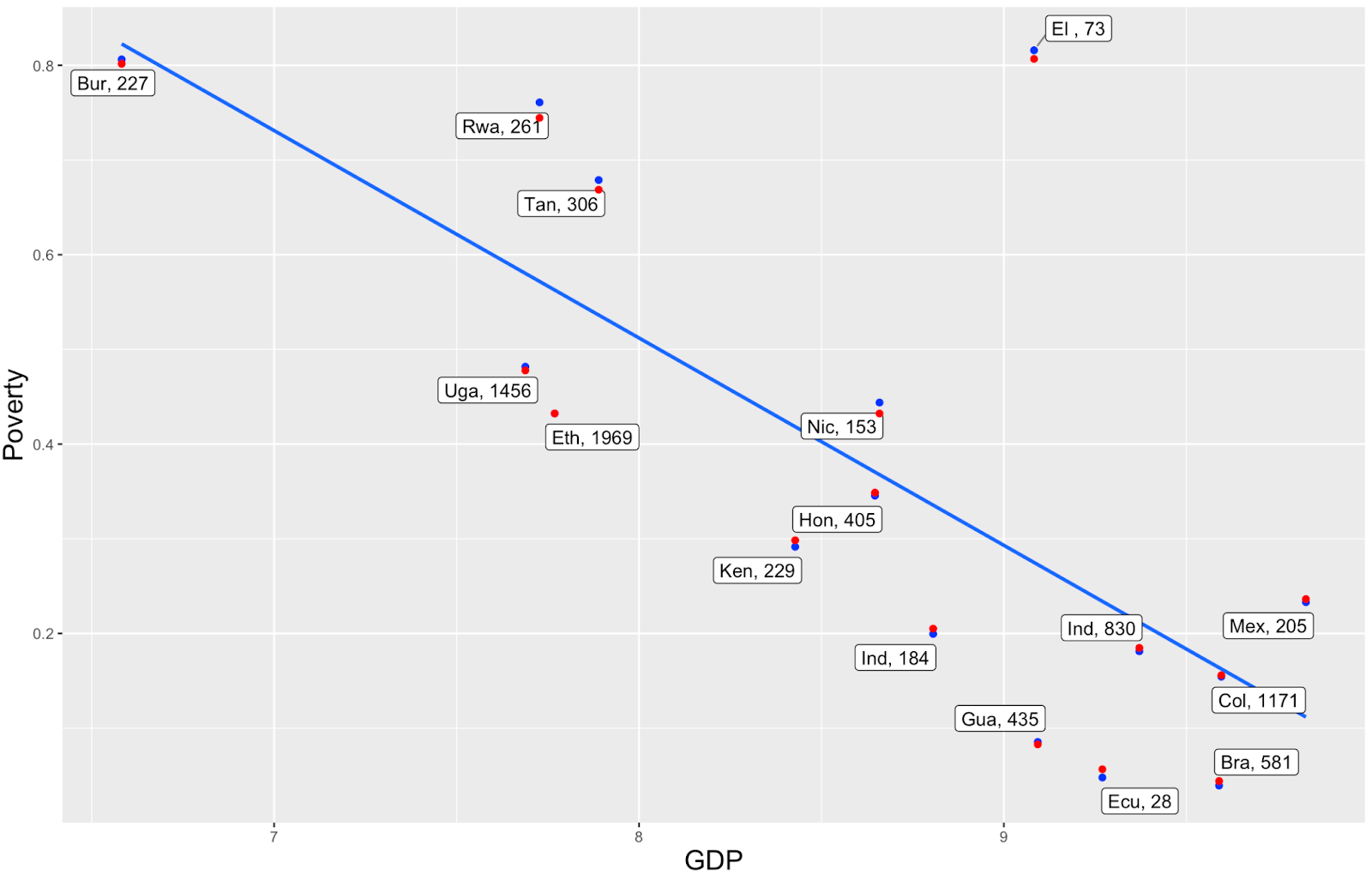
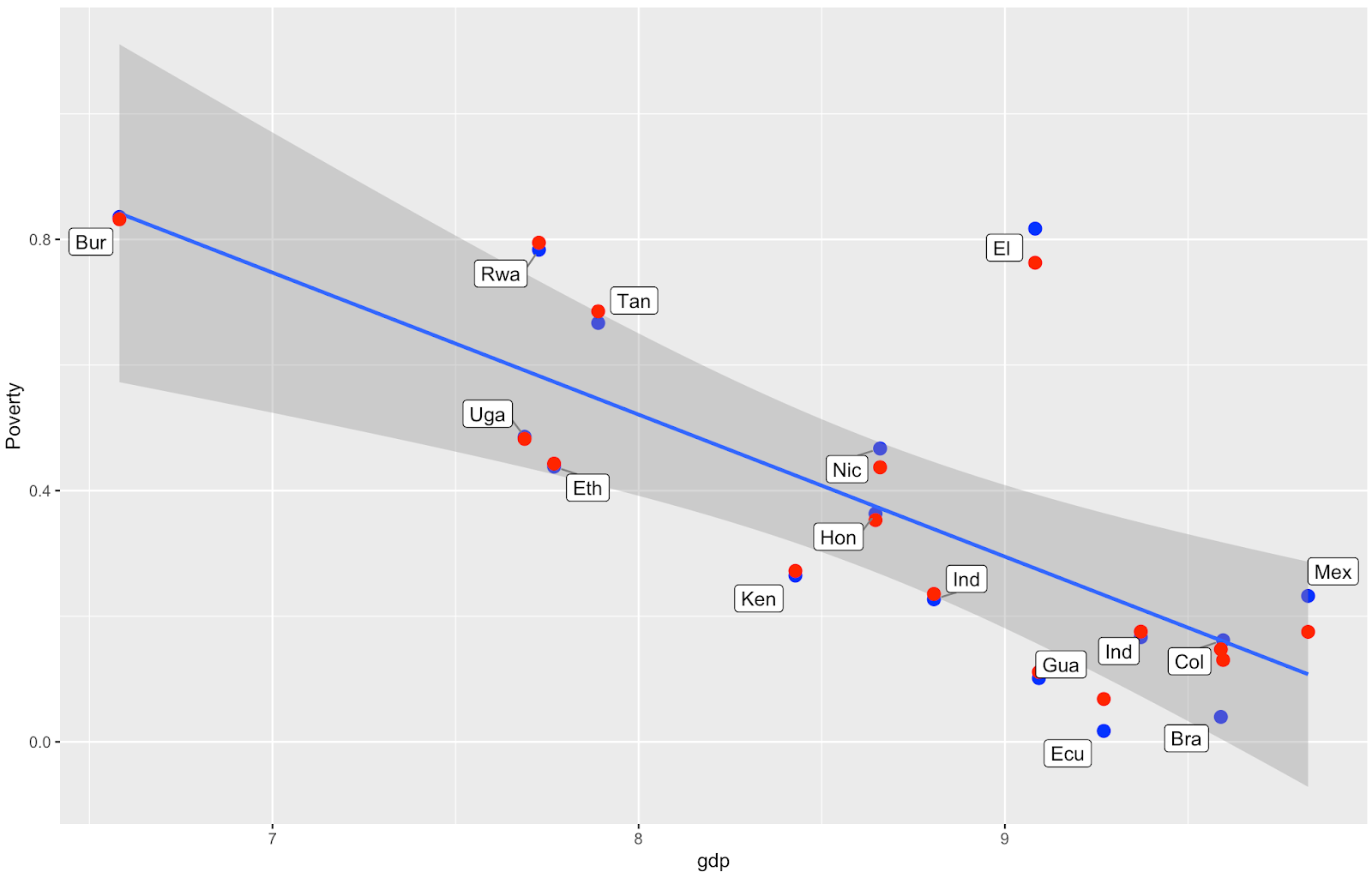
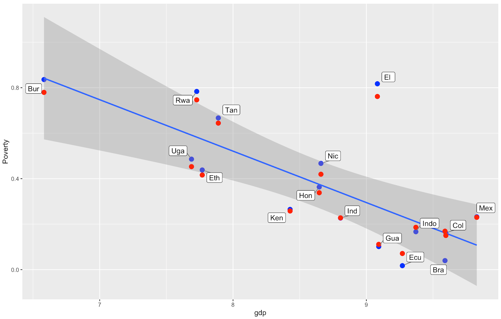
We know that Gross Domestic Product (GDP) of a country correlates closely with the country’s poverty (see graph) - so it would be great to add that information (and other country-level covariates) to the model. Also, our end goal is to estimate the world’s coffee farmer poverty rate, and for that we will need to predict the poverty of countries we haven’t visited yet.

So the data here would be like that:

We were using a stan model to model this relationship, where we say the probabilities of the farmers comen from a hierarchical model country-region-farmer. And the likelihood is a Beta(a[region], b[region]).

Current stan code:

data {
int<lower=0> C; // Number of countries
int<lower=0> R; // Number of regions
int<lower=0> N; // Number of observations (farmers)
int<lower=0> K; // Number of country predictors

matrix[C, K] X; // Country predictor matrix
vector<lower=0,upper=1>[N] pov_prob; // Observed probabilities
int<lower=1> region_n_obs[R]; // Number of observations in each region
int<lower=1, upper=C> region_country_id[R]; // region country indicators
}

parameters {
real alpha_a; // Country-level regression intercept
real alpha_b; // Country-level regression intercept
vector[K] beta_a; // Regression Coefficients
vector[K] beta_b; // Regression Coefficients
real<lower=0> sigma_a; // Error scale
real<lower=0> sigma_b; // Error scale
vector<lower=0>[R] a;
vector<lower=0>[R] b;
}

transformed parameters{
vector[C] mu_a;
vector[C] mu_b;
vector[C] country_pov;

// We need both mu_a and mu_b to estimate
// the parameters from a Beta distribution
// X are you country covariates.

mu_a = alpha_a + X*beta_a;
mu_b = alpha_b + X*beta_b;

// Country mean -- which is modeled as the mean of the region population

country_pov = mu_a ./ (mu_a+mu_b);
}

model {
int pos = 1;

// We use truncated normal as prior for our parameters
alpha_a ~ normal(0, 100);
alpha_b ~ normal(0, 100);
beta_a ~ normal(0, 100);
beta_b ~ normal(0, 100);
sigma_a ~ normal(0, 100);
sigma_b ~ normal(0, 100);

// Each region get a country-level prior

for(r in 1:R){
int country = region_country_id[r];
a[r] ~ normal(mu_a[country], sigma_a);
b[r] ~ normal(mu_b[country], sigma_b);
}

// We observed probabilities of being poor at the region-level
// We model it with a beta distribution. We use segment for vectorization due
// to the unequal size of observation in each region.

for(r in 1:R){
segment(pov_prob, pos, region_n_obs[r]) ~ beta(a[r], b[r]);
pos = pos + region_n_obs[r];
}
}

So there are three questions I have are:

  • Is it possible to set a model like that using brms? I was looking at the bf() syntax, but wasn’t sure if it was appropriate to use in my case.
  • If I am able to build the brms models, is there a way to predict the coffee poverty number from the countries we haven’t visited yet?

Thanks!

1 Like

Without taking the time to carefully understand your Stan code, from your description of the problem it sounds like you want

brm(Poverty ~ gdp + OtherCovariates + (1 | Country) + (1 | Region), family = "beta")

1 Like

Thank you @jsocolar!

Following the conversation from several weeks ago - I set up the model as follows:

formula<-bf(poverty ~ 1 + gdp +(1|Country) + (1|Country:Region) ,
phi ~ 1 + gdp +(1|Country) + (1|Country:Region),
zoi ~ 1 + gdp +(1|Country) + (1|Country:Region),
coi = 1 ) # coi is set up to 1 as there are no data with poverty rate equal to zero

fit.model<-brm(
formula,
data=sample,
family= zero_one_inflated_beta(),
chains = 4,
iter = 3000,
warmup = 1000,
cores = 4,
backend = “cmdstanr”,
threads = threading(1),
control = list(adapt_delta = 0.99)
) # no priors set up for this model

For this model I have 16 Countries which have from 1 to 149 Regions with different number of surveys in each Region. In total I have over 8,000 surveys (but I tested this model also on over 90,000 surveys from 16 Countries as well as on a dataset where there was equal sample size for each Region).

The model runs, it converges well. The Rhats are healthy (all 1.00), the fit has no divergences, and ESS look reasonable (all more than 1800).

The graphs for posterior predictive checks look as follow:

  • graph for comparing distribution of the observed variable (y) to the distributions of some of the simulated datasets (yrep) (pp_check(fit.model, ndraws=200)):

  • The scatter plot of residuals (x axis) plotted against the observed variable (y) (pp_check(fit.model, “error_scatter_avg”)):

The question I have is as follows.

I am using GDP as a country-level predictor and, in the graph below, I show the GDP vs Poverty Rate. I would expect that the model’s predicted poverty rates shift towards the regression line (the blue line showing relationship between gdp and poverty for the observed data). But in the graph some of the red points (the model’s predicted poverty rates) shift away from the line, and I am not sure what’s the explanation for this.

The blue dots are calculated by taking the averages at the regional level and then taking the average of the regional averages to get the country average. Changing the approach to poverty rate calculation (taking the average of all data at the country level) gives nearly the same results. The labels indicate the country and the number of surveys in each country.

Would you have any suggestion what can be happening here and how I can try to improve that? I tried various things already:

  • to simplify the model (reduce the number of levels only to Country).
  • not model for phi nor zoi.
  • take various sample sizes from the original dataset to check the behavior of the model.
  • I tried using the default brms priors and other non-informative priors recommended in the Andrew Heiss blog post: “A guide to modeling proportions with Bayesian beta and zero-inflated beta regression models”.
  • I also tried change the way the blue dots are calculated (simple average for a Country from all data for given country, average of averages of poverty at Regional level to get the Country average)
  1. Should I expect the “red dots” to get close to the line. If no, why?
  2. If yes, what are some other possible causes of why this is happening.

Would you have any suggestions about what might be missing in the model?

Yes, I would expect the model estimated means for the countries to move toward the regression line…
I tried to simulate data similar to yours, to think about this. Here is the code and resulting plot (unfortunately I forgot to set.seed for this run):

library(brms)
library(ggplot2)


###simulate zoib data (with no zeroes); country varying intercept only to keep simple. Phi fixed
n_country <- 20
n_regions <- 50
n <- n_country*n_regions
country <- rep(1:n_country, each=n_regions)
std_gdp_country <- rnorm(n_country, 0, 1)
gdp <- rep(std_gdp_country, each=n_regions)
a_zoi <- 0.05
b_zoi <- -0.001
a_b <- 0.6
b_b <- -0.05
z_c <- rnorm(n_country, 0, 0.01)
zoi <- a_zoi + gdp*b_zoi
phi <- 10
mu <- (a_b + z_c[country]) + gdp*b_b
shape1 <- mu * phi
shape2 <- (1 - mu) * phi
y <- vector("numeric", n)
y <- ifelse( rbinom(n, 1, zoi)==1, 1, rbeta(n, shape1, shape2))

d1 <- cbind(gdp,country,y)
d1 <- data.frame(d1)
d1$country <- factor(d1$country)
str(d1)
summary(d1)

#histogram
hist(d1$y, breaks=100)

#simple plot for country average y against country gdp
y_c <- aggregate(y ~ country, d1, mean)
plot(std_gdp_country,y_c$y)

#model, default priors
m1 <- brm(bf(y ~ 1 + gdp + (1|country), zoi ~ 1 + gdp, coi = 1), 
	data=d1, family = zero_one_inflated_beta, cores = 4)
m1


#plot for model estimated values of mean y per country, mean y per country from raw data, and gdp
d2 <- aggregate(gdp ~ country, d1, mean)
f2 <- fitted(m1, newdata=d2)
f2 <- data.frame(f2)
y_est_mean_country <- f2$Estimate
d3 <- cbind.data.frame(y_mean_country, y_est_mean_country, std_gdp_country)

p2 <- ggplot(d3, aes(x=std_gdp_country, y=y_mean_country)) + geom_point(size=3, color="black") + 
	geom_point(aes(x=std_gdp_country, y=y_est_mean_country), size=3, color="red")
p2

I’m not sure why a few countries in your analysis would move away from the regression line compared to the raw data means, but here are some thoughts I had:
(Also, is the blue regression line from the model? Or is that a linear model you fit in the plot?)
The link function is logit for this model, and the partial pooling is happening on the scale of the linear predictor. How are you getting those red points for the country? Are you predicting from the model only for country, or are you predicting for all observations and then averaging the predictions? Just wondering if somehow it comes down to how you get an average for the raw data vs how you are getting it from the model.

Thank you so much @jd_c for the response and the great simulation! It helped a lot!
I replicated the approach you applied in your modeling for my simplified model (only one group level - Country, and not modeling for phi). I wanted to check how the model behaves on the data I have - whether the problem is with my post-modeling analysis or simply the model with my data behaves differently. Here is the result (sample - is a random sample of 3,000 observations from my original - over 30,000 observations dataset).

So the simplified formula for the model:

formula<-bf(Poverty ~ 1 + gdp + (1|Country) ,
zoi ~ 1 + gdp ,
coi = 1 ) # out of curiosity - why do you not model for phi and why zoi has only the country level predictor?

fit.model<-brm(
formula,
data=sample,
family= zero_one_inflated_beta(),
chains = 4,
iter = 3000,
warmup = 1000,
cores = 4,
backend = “cmdstanr”,
threads = threading(1)
)

And here is the plot of the blue - red dots comparison. So unfortunately the red dots don’t want to move closer to the regression line. And a few points (Rwa, Ug, Tan, Hon) still move away from the line rather than to the line.

In regard to your question - the blue line is fitted to the blue dots - so to the observed values from raw data.
In my original model for the red dots I get the predicted_draws for the model and new data (predicted_draws(model, newdata), where new data contains Country and gdp variables) - then I average for the Country.

For the above graph to obtain the red dots I applied exactly the same approach as you did in your model (fitted(model, newdata)).

Is it possible that this is because of the poverty data I have? They are not exactly continuous (here is the histogram of the poverty values from the 3,000 sample data):

|520x302.3365877085109

Ok, so it doesn’t appear to be a difference due to transformation when making the predictions…which is what I was wondering about.

Honestly because I just got tired of programming the simulation haha. I wrote it up between projects in my day job, and I just got tired of writing it, so I went for something more simple than your data. You can modify it such that phi depends on GDP and country if you like. Simulations can be a good way to understand your model.
But also because it is good to start simpler and see if the same thing happens. Your distributional model where you model phi and zoi is pretty complex.

If you have a lot of observations per country and/or are already close to the mean, then they won’t move a lot.

Yes, I am not sure why this happens… maybe I’m missing something obvious… Hopefully someone smarter will chime in. I’ll think about it.

Thank you so much @jd_c . Yes - the behaviour of the ‘red dots’ is weird - I will still look for the explanation of that. But your response helped me a lot!

What is the proportion of 1’s for poverty for each of the countries from the raw data (3,000 obs sample) used in the above simplified bf(Poverty ~ 1 + gdp + (1|Country), zoi ~ 1 + gdp, coi=1) model? Also, can you rerun this model on that same sample of data without predicting zoi by gdp? So just try bf(Poverty ~ 1 + gdp + (1|Country), zoi ~ 1, coi=1), make predictions, and see if the plot still has Rwa, Ug, Tan, Hon moving further away from the line.
Last, try subtracting 0.001 from the 1’s, and then run brm(Poverty ~ 1 + gdp + (1|Country), family=beta) and then see if the predictions behave the same way. This would remove the mixture part completely.
I’m wondering if the behavior is due to the bernoulli mixture parts of this model.

Hi @jd_c! So his is the distribution of 1s across countries in the 3,000 survey sample:

I also run the model you recommended on the same sample:

​​formula<-bf(Poverty ~ 1 + gdp +(1|Country) ,
zoi ~ 1,
coi = 1 )

fit.model<-brm(
formula,
data=s,
family= zero_one_inflated_beta(),
chains = 4,
iter = 3000,
warmup = 1000,
cores = 4,
backend = “cmdstanr”,
threads = threading(1)
)

And this is what I got:

So Rwa, Tan (which are above the line) moved to the regression line now but Uga and Hon (which are below the line) - moved away. And also Bur, Ken, Eth moved away. I don’t see any clear pattern in regard which points move ‘the right way’ and which not - I checked the distribution of 1s across countries, distribution of Poverty variable per country (to check its variability), number of surveys per Country - and I have no hypothesis.

Lastly I run the beta model on the same sample but with 1s replaced with 1-0.001:

formula_d<-bf(AP2_Score ~ 1 + gdp +(1|Country))

fit.model_d<-brm(
formula_d,
data=s_1,
family= Beta(),
chains = 4,
iter = 3000,
warmup = 1000,
cores = 4,
backend = “cmdstanr”,
threads = threading(1)
)

And this is the result:

Thanks again for looking into this.

can you post the results of ranef(fit.model) and ranef(fit.model_d) ?

ranef(fit.model):

ranef(fit.model_d):

Are you getting your blue regression line from geom_smooth(method='lm', formula= y~x) in ggplot2? I can replicate the behavior for some points if you are using that instead of using the line from the model itself. See the comparison of plots below, for the same data, using the simulation code that I posted above. I have circled in yellow at the top left of each plot where the behavior of the model estimate goes away from the lm regression line from ggplot2 but toward the line from the model. The estimates are partially pooled toward the intercept for the beta model on the scale of the linear predictor, and the line from the zoib model is not the same as the lm line from ggplot2 fit through the raw data.
I’m not sure that this is the answer to all of this, but you should be plotting the regression line from the zoib model (if you aren’t already).

#plot for model estimated values of mean y per country, mean y per country from raw data, and gdp, vs linear regression line from geom_smooth
d2 <- aggregate(gdp ~ country, d1, mean)
f2 <- fitted(m1, newdata=d2)
f2 <- data.frame(f2)
y_est_mean_country <- f2$Estimate
country2 <- d2$country
y_mean_country <- y_c$y
d3 <- cbind.data.frame(y_mean_country, y_est_mean_country, std_gdp_country, country2)

p.est_vs_lm <- ggplot(d3, aes(x=std_gdp_country, y=y_mean_country, label=country2)) + geom_point(size=3, color="black") + 
	geom_point(aes(x=std_gdp_country, y=y_est_mean_country), size=3, color="red") +
	geom_text(hjust=2, vjust=0.5) +
	geom_smooth(method='lm', formula= y~x)
p.est_vs_lm

#plot for model estimated values of mean y per country, mean y per country from raw data, and gdp, vs zoib model regression line
country <- rep("NNN", times=1000)
gdp <- seq(from=-2, to=2, length.out=1000)
d4 <- cbind.data.frame(country, gdp)
d4$country <- factor(d4$country)
f3 <- fitted(m1, newdata=d4, allow_new_levels=T)
f3 <- data.frame(f3)
f3$gdp <- d4$gdp

p.est_vs_zoib <- ggplot() + geom_point(data=d3, aes(x=std_gdp_country, y=y_mean_country), size=3, color="black") + 
	geom_point(data=d3, aes(x=std_gdp_country, y=y_est_mean_country), size=3, color="red") +
	geom_text(hjust=2, vjust=0.5) +
	geom_line(data=f3, aes(x=gdp, y=Estimate))
p.est_vs_zoib

Yes @jd_c - I used geom_smooth lm method - so I need to change that - thanks for pointing that!

But even after plotting the regression line from the zoib model the points are still moving away:

Yeah, going back to my original idea, my only thought is that this has to do with the non-linear transformation with the link function in the model. For example,
a <- c(-3,-2,-1,0,1)
plogis(mean(a))
is not the same as
mean(plogis(a))
The model exhibits partial pooling for country-level intercepts toward the global intercept on the scale of the linear predictor. You should be able to use fitted(model, scale='linear') and see them move toward the model estimated Intercept on the logit scale. I’m just wondering if when you compare model predictions on the outcome scale to average values of groups aggregated across many observations in the group on the outcome scale, if it can exhibit the behavior that you see.

Thank you @jd_c for all your help! I think I need to investigate more.