Let this run on my computer for a few different group and term sizes
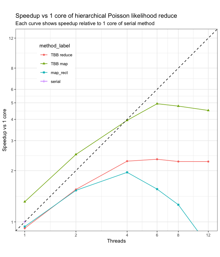
It seems like map_rect does better as the number of terms in each group increases
Maybe I’m doing something goofy because these results are pretty wild!
Data from the tests are here
bench-2019-07-30_16-36.csv (92.8 KB)
I made the graphs with the below
library(data.table)
library(ggplot2)
perf_dt = fread("./bench-2019-07-30_16-36.csv")
perf_dt[, group_label := factor(paste0("Groups: ", groups), ordered = TRUE, levels = paste0("Groups: ", as.character(unique(sort(groups)))))]
perf_dt[, terms_label := factor(paste0("Terms: ", terms), ordered = TRUE, levels = paste0("Terms: ", as.character(unique(sort(terms)))))]
ggplot(perf_dt, aes(threads, method_speedup, colour=method_label, shape=method_label)) +
  geom_point() + geom_line() +
  geom_abline(slope=1, intercept=0, linetype=2) +
  ggtitle("Speedup vs 1 core of hierarchical Poisson likelihood reduce", "Each curve shows method specific speedup relative to 1 core of respective method") +
  ylab("Speedup vs 1 core") +
  xlab("Threads") +
  scale_x_log10(breaks=c(1, 1:8*4)) +
  scale_y_log10(breaks=c(1,4, 6, 10, 15, 20, 30)) +
  facet_wrap(group_label~terms_label, ncol = 3) +
  theme(legend.position = "bottom") +
  theme_bw()

ggplot(perf_dt, aes(threads, serial_speedup, colour=method_label, shape=method_label)) +
  geom_point() + geom_line() +
  geom_abline(slope=1, intercept=0, linetype=2) +
  ggtitle("Speedup vs 1 core of hierarchical Poisson likelihood reduce", "Each curve shows method specific speedup relative to 1 core of respective method") +
  ylab("Speedup vs 1 core") +
  xlab("Threads") +
  scale_x_log10(breaks=c(1, 1:8*4)) +
  scale_y_log10(breaks=c(1,2, 5, 10, 20, 40, 80, 160, 320)) +
  facet_wrap(group_label~terms_label, ncol = 3) +
  theme(legend.position = "bottom") +
  theme_bw()