Here is an example of the parallel coordinates plot.
Divergences are shown in green.
Top plot contains non-normalized samples and bottom plot density equalized samples
Here is an example of the parallel coordinates plot.
Divergences are shown in green.
Top plot contains non-normalized samples and bottom plot density equalized samples
That is pretty nifty!
Trying to understand what that plot is telling me, and it looks like it’s saying that all the divergent transitions have tau ~ 0
what did you do to “density equalize” the bottom plot? just subtract the min and then divide by the max so that the samples all range from 0-1?
One nice thing here is that I could actually imagine doing this for ~ 2000 parameters, or at least something similar. whereas 4 Million pairs plots is out of the question.
I transformed the sampling density to uniform with inverse cdf.
def equalize_arr(arr):
    """Equalize array (n, m),
       n=number of samples
       m=number of parameters
    """

    n, *m = arr.shape
    ravel = False
    if not m:
        arr = arr[:, None]
        ravel = True
    ind = np.indices(arr.shape)
    sort_order = np.argsort(arr, axis=0)
    sort_back_order = np.argsort(sort_order, axis=0)

    sorted_arr = arr[sort_order, ind[1]]
    sorted_csum = (sorted_arr - sorted_arr.min(0)).cumsum(0)
    sorted_csum /= sorted_csum[-1, :]
    equalized_arr = sorted_csum[sort_back_order, ind[1]]
    if ravel:
        equalized_arr = equalized_arr.ravel()
    return equalized_arr
One can do other kind of normalizations too, but if the sample space is closer to log than linear it can show all the values concentrating near 0.
Plotting code
extract = fit.extract(permuted=False, inc_warmup=False)
ext = extract.reshape(-1, extract.shape[-1], order='F')

divs = np.concatenate([item['divergent__'][fit.sim['warmup']:] for item in fit.get_sampler_params()])
divs_bool = divs.astype(bool)
ext_eq = equalize_arr(ext)

div_samples = ext[divs_bool, :]
nondiv_samples = ext[~divs_bool, :]

div_samples_eq = ext_eq[divs_bool, :]
nondiv_samples_eq = ext_eq[~divs_bool, :]

plt.style.use('ggplot')
plt.figure(figsize=(8,8))
plt.subplot(211)
plt.plot(nondiv_samples.T, color='k', lw=1, alpha=0.02);
plt.plot(div_samples.T, color='lime', lw=1, alpha=0.1);

plt.xticks(np.arange(ext.shape[-1]), fit.sim['fnames_oi'], rotation=90)
plt.grid('off') #  due to ggplot style
plt.grid(axis='x')

plt.subplot(212)

plt.plot(nondiv_samples_eq.T, color='k', lw=1, alpha=0.02);
plt.plot(div_samples_eq.T, color='lime', lw=1, alpha=0.1);

plt.xticks(np.arange(ext.shape[-1]), fit.sim['fnames_oi'], rotation=90)
plt.grid('off') #  due to ggplot style
plt.grid(axis='x')

plt.tight_layout()RHMC is in the released C++ version of Stan now, but it’s not available in any of the interfaces.
All the C++ library functions are fully tested for higher-order autodiff, but we haven’t tested all the Stan functions thoroughly enough for us to want to release it.
This is fantastic.
It would be even better on the unconstrained scale (where that tau = 0 is probably really log tau -> -infinty), but that’s not yet easy to produce.
The [0, 1] is odd, but clearly easier to scan. Would standardizing be better (subtract mean and then divide by standard deviation)?
I’m still trying to understand the prominent sawtooth pattern.
@betanalpha — see any problems with this?
Assuming not,
@jonah — consider this a feature request for BayesPlot and ShinyStan.
@Bob_Carpenter @ahartikainen Yeah, I think this offers a perspective that we really don’t get from any of the diagnostic plots we typically make. I don’t see any reason the same thing couldn’t be wrapped up into a convenient R function for bayesplot. Unless anyone sees a problem we’re overlooking,I will open an issue so it officially gets on the to-do list.
My concern here is the false positive aspect. We can talk ourselves into tau being bad because we already know it should be bad, but if you looked at the plot without any prior bias would you think the other parameters look okay? Why should be be considered okay here? It seems like the non-divergence iterations bifurcate whereas the divergent ones don’t, so it’s not like they’re consistent or anything.
Also let me emphasize again that in practice it’s usually the correlation plots that help you identify what part of the model is causing trouble so I’m not sure how useful this plot will be. Ultimately, the test will be not applying to the 8 schools model but rather on new problems and see if it ends up being helpful.
Yes, one could do that. The only problem is that some values are closer to log-scale. So it would look like almost all the points are in one place.
Me too. Is it an artifact from the transformation or a real phenomenon?
I agree with this. In my opinion, this plot should be (if used) the first step to identify problematic areas.
This plot should be tested a bit more to see if it is really useful or not.
Also, do notice that the normalization function assumes that there are no duplicate points in the sample. If there are, they will be a shifted due to cumulative function. Not really a problem if one only does visual stuff (n>1000), but it should not be used anywhere else.
You can see some of that from the lines through the graph. In fact, I think that’s the advantage of this. You can sort of see it all at once with the green lines through the black/grey.
Isn’t the boundary behavior going to be fishy?
Yo Ari, I got a model for you to test out. Tell me what’s causing my divergences! I know how to fix it, so your challenge is to figure that out.
Link here: GitHub - bbbales2/basketball
The file is ‘westbrook.R’. The data gets loaded up and model executed in the first 16 lines. The rest is diagnostics and plots. As the model is configured, you should get 50~ divergences (4 chains, 2000 iters each).
It’s an approximate GP technique I was testing out. The story is:
I took Russell Westbrook’s made-missed shots from the 2015 season (or at least most of it – not sure if the dataset is complete). It’s an r/nba think to talk about how in 4th quarters of games Westbrook turns into Worstbrook (as opposed to Bestbrook), so the idea is maybe we could estimate Westbrook’s shooting percentage not as a single number, but as a function of the game time (and see the difference in Bestbrook and Worstbrook)
(it’s from this thread, but don’t read too far, cause this has the answer in the text: Approximate GPs with Spectral Stuff)
It took me awhile to work out where the divergences were coming from because I wasn’t sure if it was the approximation that was causing the divergences, or something weird with the data (and an exact model would have caused divergences), or something else. Anyway, seems like a good level 2 crackme. (edit: and I sure would have appreciated something more than pairplots when I was debugging this)
Re the prominent sawtooth pattern. Each of the theta is probably a mixture of gaussians through the mu mean and tau sd. Let mu and tau be fixed. Then as a mechanical analog, thetas are independent harmonic oscillators with equal periods and random phases. In essence, balls on springs hanging from a stiff metal plate, bouncing up and down.
Now, un-fix mu by instead of dangling the plate from the ceiling on a rope, dangle it from a spring. Then the harmonic oscillators are all coupled together, their motion affects the motion of mu. When the oscillators all pull downward, the plate moves downward, when they all push upward, the plate moves upward. The coupling through mu causes partial synchronization of the oscillators. In order to have a constant mu, they need to have about half of them going up, and half of them going down. If mu has smaller posterior sd than thetas which it should (about 1/sqrt(8)) then for a diagonal mass matrix, it has 8 times the mass and its velocity which is p/m is 1/8 as much so it’s kind of constant relative to the oscillations of the theta.
This is all a guess. But I think it makes reasonable sense. I now think we need a Stan T-shirt with 8 balls dangling from a plate dangling from the ceiling.
Tau here corresponds to the stiffness of the springs. When tau is small, it means you don’t stretch the springs much compared to equilibrium position, so your oscillation amplitude is small. When tau is large then the springs are soft, and you can wiggle around a lot. So, imagine you’re going along with a tons of balls wiggling on springs, and then suddenly all the springs freeze up into hard stiff steel rods (tau goes to 0). BANG all the balls need to snap back to the center forcefully. If you’re simulating this, you need to accelerate the balls dramatically, and then move the balls with a LOT of velocity. For any reasonable step-size you will be unable to get your balls back to the right place, they will overshoot, which corresponds to them stretching a steel rod by a lot more than they would in reality, which corresponds to then applying a restoring force on the balls that is way way way too large, which corresponds to turning around and overshooting again, compressing the rod by way too much, which corresponds to turning around… and diverging out to infinity after a few cycles.
Finally, imagine that in addition to the spring forces on the balls, there are winds blowing around, so that the ball trajectories are randomly perturbed by additional forces. These additional forces are the forces from SPSA approximate gradients in my discussion here:
Now imagine each ball internally has some kind of computer mechanism and some mass it can wiggle around inside the ball using battery energy. We let it wiggle with random normal perturbations on regular, extremely fast intervals. This is the random noise I added to the momentum step in my sampler. Finally, we have all the ball computers wired together so they can detect their total energy. when their total energy drifts a little too low, they run their internal mechanism adding some velocity to all the balls in the direction of current travel, proportional to the current velocity. when the total energy is too high, they all apply a viscous drag on their spring to slow themselves down. This is the control viscous force.
Next, we take snapshots of the system at regular time intervals, but we throw away all the snapshots where the system didn’t have within epsilon of the right total energy that it had at the beginning of the run… Finally, at the end of all of it we randomly choose one of the remaining snapshots with probability proportional to exp(-TotalPotentialEnergyInSprings)…
That’s a mechanical description of my momentum diffusion approximate HMC I used in linked thread above.
As someone who had no idea what was being plotted, tau was the one parameter that jumped out at me as being weird. Make of that information what you will
Notice in the plot:
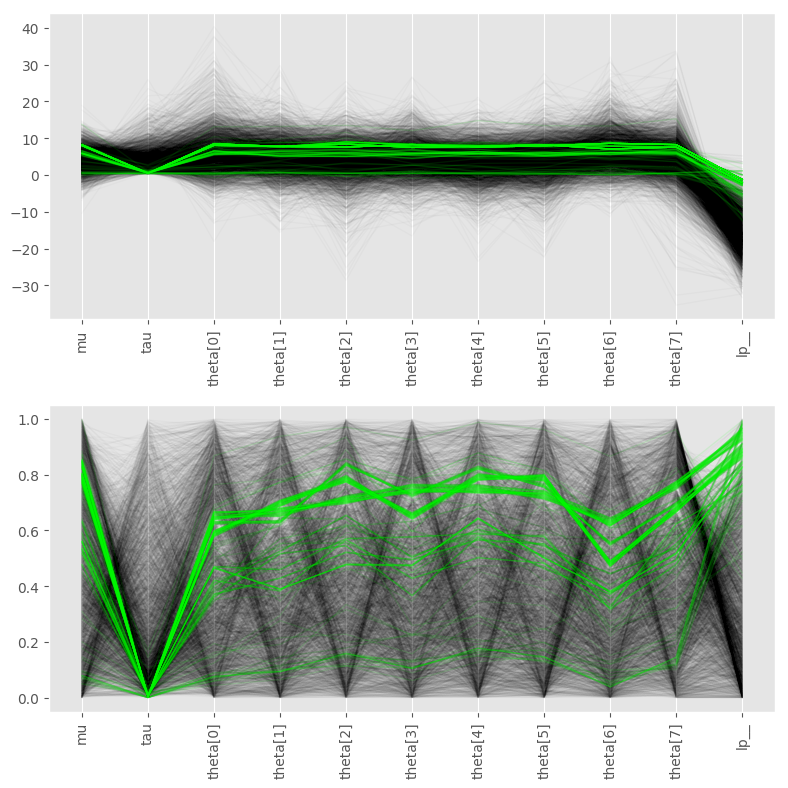
In the upper plot, when we get a divergence, tau is near zero, and the thetas are all basically constant (horizontal green lines). In the ball and spring scenario this is due to the fact that tau is the RMS displacement of the balls from the average ball location. If tau drops to zero, all the springs harden into steel rods of the same length, and all the balls have to snap to the same place… and they do, but as I said the forces are enormous and we need a very small time-step to track these dynamics, but Stan takes constant time steps, so the simulation diverges.
The solution here is to tell the model that the springs are never steel rods of the same length, basically a zero avoiding prior on tau, which is well known in the 8 schools example. But I think the mechanical analogy is apt and can help debug more difficult models. I too think bayesplot should produce these parallel coord plots. They could be very useful. Note though that both a natural scale plot (or a log of a natural scale plot) and a probability scale plot could be useful (ie. both the upper and lower). The lower plot doesn’t preserve the flatness of the thetas during divergences which are essential to the story.
Hmm, nice, I will have to study the approximation function a bit further. Here are some plots I did.
columns: First 10 are z vector, sigma, l, f…, and I have removed error and lp__
First I did parallel for the whole data.
Ok, after that I plotted this for the first 12 cols
Ok, sigma, z_0 and z_1. Let’s check out those


But 12 plots is small amount, so here is the scatter table plot
And The same plot with equalized density
So something to do with sigma and when it’s high. Is this somekind of inv_logit thing. Not sure. I did not check the f further. It could be that there is something else than noise.
I don’t have the slightest idea what the approx_L function is doing, but I see that in the end it produces something where we do
inv_logit(approx_L * z)
I also see approx_L has some kind of lagged structure Ht[n] is a function of Ht[n-1].
and approx_L is linear in sigma. so I assume as sigma gets big z0 and z1 have to go to zero or we do something stupid like predicting that the player has binomial(1) or binomial(0) shot accuracy for essentially all time, and the data bounces us back away from there pretty hard.
Yeah, that’s it! Nice.
In the end I decided it was some interaction of z[0] and sigma that was causing the problem. You get these divergences when you fit GPs to data that looks flat (like if it’s just iid noise around the x-axis which is kinda like lengthscale going to zero). In the end I just fixed sigma to be a constant.
How’d you know to only look at the first 12 parameters? How’d you decide to look at z[1]?
Would this look better as a geom_jitter? (Like these guys http://ggplot2.tidyverse.org/reference/geom_jitter.html)
They looked different than others. Also if one calculates mean and std in transformed space they are different than the rest of the parameters.
z1 has low std.
Points could be possible, but it would loose the sample dependence.


